


Log in
Who is online?
In total there are 2 users online :: 0 Registered, 0 Hidden and 2 Guests None
Most users ever online was 202 on Sat Apr 10, 2021 9:45 pm
Latest topics
NR Site Full Review
2 posters
Page 1 of 1

NR Site Full Review
![]() by ynot563 Tue Jan 29, 2013 12:23 pm
by ynot563 Tue Jan 29, 2013 12:23 pm
I'm not sure if this was the official legit review considering it was from a volunteer person on the forumotion forums. Its a little bit harsh but the most of these pts I do agree with. Here is what we can work on. I encourage everyone, not just the admins, that is active on this site to help out and make this site the best it can be. Whether it be design, coding, or organization tips. Please don't hesitate to give out tips and ur honest opinion of the site. Thanks in advance!
-Ynot563
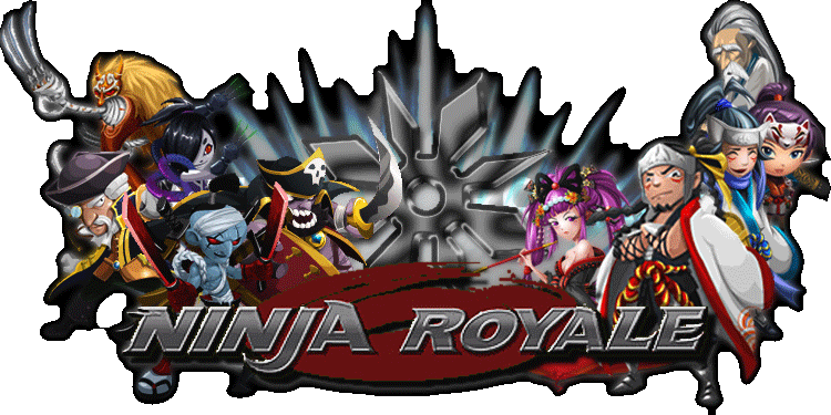
Ninja Royale
Banner 6
You have pretty much everything you need in there, and that seems pretty well minded... but unfortunately, there's that obnoxious white border around the entire thing that makes it look overall pretty poorly done. I'll give this a 6 because you seem like you tried to have a good one, but it's an edgy 6.
Navigation Bar 4
Pretty unique from what I've seen, definitely got your message across as far as the theme of the site. Rather well done. //I'd personally suggest getting some sort of hover action in there, but that's just input.
Post & Forum Icons 3
Small, fit the theme, and rather well. There were a few that were completely out of place, namely New Posts [Locked], Announcement and Global Announcement - the rest were good though.
Background 4
Seems like it's stretched to fit the page, which is definitely good. Unfortunately, the image itself seemed shabby and pixelated, possibly due to being stretched down.
Other Forum Images 1
Only other images I could find to really rate were the ranks, and it just seems poorly executed as a whole.
Theme 7
You definitely had a good overall theme, and despite the few flaws I picked out in earlier sections, it seems like it came together rather nicely.
Forum/Category Layout & Organization 5
Doesn't seem like there was very much organization with what you'd actually done with the sections. You could have just ordered them better...
Widgets 3
Average. Nothing at all special.
Notable/Unique Design & Coding Features 6
Chatbox was pretty well designed. Flowed with the rest of the theme, and having that picture for the background of it was unique enough, but it made reading the actual usernames a bit difficult.
Design & Coding Extras 3
The background stretching to fit your monitor was pretty cool. Having a unique background for the chatbox member list was, too, but I don't think that worked as well as you'd hoped it would in the end.
Member activity 5
1166 Messages for 137 Members is somewhat poor.. gives the average member 8/9 posts. Doesn't seem like there's a lot of active topics for posting, either.
Staff activity 4
Three of the top four posters on your forum are staff members, and even they don't seem to be posting actively right now.
Usergroups 2
The only coloured group is the staff, which would be fine if things were active. You seem to separate people into 3 groups: people who don't play often, people who play normally, and people who are extremely active. That seems poor overall to me.
Link to actual review: http://help.forumotion.com/t119730-ninja-royale-full-review
-Ynot563
Ninja Royale
Graphics and Layout
Banner 6
You have pretty much everything you need in there, and that seems pretty well minded... but unfortunately, there's that obnoxious white border around the entire thing that makes it look overall pretty poorly done. I'll give this a 6 because you seem like you tried to have a good one, but it's an edgy 6.
Navigation Bar 4
Pretty unique from what I've seen, definitely got your message across as far as the theme of the site. Rather well done. //I'd personally suggest getting some sort of hover action in there, but that's just input.
Post & Forum Icons 3
Small, fit the theme, and rather well. There were a few that were completely out of place, namely New Posts [Locked], Announcement and Global Announcement - the rest were good though.
Background 4
Seems like it's stretched to fit the page, which is definitely good. Unfortunately, the image itself seemed shabby and pixelated, possibly due to being stretched down.
Other Forum Images 1
Only other images I could find to really rate were the ranks, and it just seems poorly executed as a whole.
Theme 7
You definitely had a good overall theme, and despite the few flaws I picked out in earlier sections, it seems like it came together rather nicely.
Forum/Category Layout & Organization 5
Doesn't seem like there was very much organization with what you'd actually done with the sections. You could have just ordered them better...
Score: 30/50
Special Features & Originality
Special Features & Originality
Widgets 3
Average. Nothing at all special.
Notable/Unique Design & Coding Features 6
Chatbox was pretty well designed. Flowed with the rest of the theme, and having that picture for the background of it was unique enough, but it made reading the actual usernames a bit difficult.
Design & Coding Extras 3
The background stretching to fit your monitor was pretty cool. Having a unique background for the chatbox member list was, too, but I don't think that worked as well as you'd hoped it would in the end.
Score: 12/20
Generalities & Activity
Generalities & Activity
Member activity 5
1166 Messages for 137 Members is somewhat poor.. gives the average member 8/9 posts. Doesn't seem like there's a lot of active topics for posting, either.
Staff activity 4
Three of the top four posters on your forum are staff members, and even they don't seem to be posting actively right now.
Usergroups 2
The only coloured group is the staff, which would be fine if things were active. You seem to separate people into 3 groups: people who don't play often, people who play normally, and people who are extremely active. That seems poor overall to me.
Score: 11/25
Total Score: 53/100
Total Score: 53/100
Link to actual review: http://help.forumotion.com/t119730-ninja-royale-full-review
ynot563- Elite

- Posts : 463
Re: NR Site Full Review
![]() by RussellNg1980 Wed Jan 30, 2013 2:35 am
by RussellNg1980 Wed Jan 30, 2013 2:35 am
Banner... Easily solved. A valid comment I guess and since we use the transparency theme, guess having the edges merged slightly with the background would look nicer.
Navigation Bar... No hover action for me. Its just a distraction.
Background... Reviewer don't know what images we are working with. The base image comes from NR facebook page or in-game which means resolution isn't gonna be that good anyway.
Other images... This comment shouldn't even be applicable.
Forum category... Probably true. But its a new forum and one day have to figured out how to organize it in a way that's easier to search. This would get better I guess.
Member activity... Everyone would love to have more active members but you can't force people. Takes time and although true... hopefully it would get better soon.
Usergroups... Reviewer has a point but we already have rankings like initiate, apprentice, etc... Not sure if that's applicable but maybe we can just change the colour/font of the Names for different rankings. That way maybe we can make people feel proud that their activities get acknowledged.
Others... We should get the Kudos (Likes) up. And make a Post of the Month thread based on the number of Kudos received. And we can have a gold plague around their avatar like in the game for rankings.
Cheers

RussellNg1980- Elite
- Posts : 212
Page 1 of 1
Permissions in this forum:
You cannot reply to topics in this forum|
|
|
» Post your current game here!
» Looking for casual game? This might be your solution.
» Clash of Clans
» Chaos Fighters
» New Event?
» KUNG FU HOUSE.
» Moo was 100.000th visitor on NR Forum!
» BRAVE FRONTIER